Know What to Throw
When educating around what goes in – or doesn’t go in a recycling cart – messaging space is limited and attention spans are short. The Recycling Partnership recently set out to identify best practices for signage and mailers to help determine how to communicate the most effectively to get the best impact. We conducted an online user test of 1,197 people and interviewed 20 people across the country to get our questions answered. Here are our top findings:
1. People want details on what they should and shouldn’t recycle.
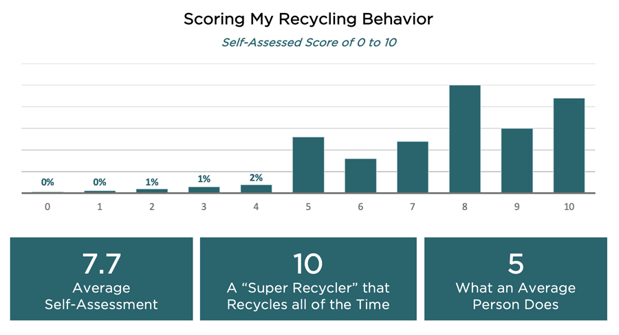
As we have seen in our other surveys, people are overly confident about recycling in general. It should be noted that this is not an unusual outcome when people rate themselves. Despite that self-assurance, these interviews revealed that just beneath the surface is a lack of confidence about the right way to recycle. People think they are recycling properly, but this user testing (and contamination rates) confirm their knowledge is often wrong.

If you were to rate yourself on a scale of 0 to 10, where 0 means you do not recycle at all, 5 is what an average person does, and 10 means you are a “super recycler” who recycles everything all the time, what score would you give yourself?
Case in point, 49% of those surveyed believed plastic grocery bags should go in household recycling. Even the people who rate their own behavior 10 out of 10, believe plastic grocery bags should go in their household recycling.
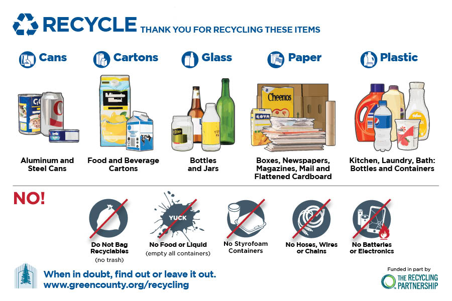
When shown a well-organized mailer displaying clear dos and don’ts of recycling like The Recycling Partnership’s infocard (as seen in Campaign Builder), and asked whether or not a material should go in recycling, people readily found the answer.
Most participants became visibly and audibly overwhelmed or even pushed away when they encountered a sample that threw a laundry list of what is and isn’t recyclable at them, was cluttered with unnecessary graphics, or required too much effort to navigate.

(Participant): “I definitely like this one.”
(Interviewer): “Really?”
(Participant): “Yeah.”
(Interviewer): “Tell me what makes you like this one.”
(Participant): “The images, they look like they’re actually, you know, products… The stuff that can’t be recycled has like a little line across it. And then I also like the stuff that can be recycled, its labeling in the blue color.” “If I would receive this, I would just feel like very happy that I did. And this would be like, ‘Whoa, you know, this is nice.’ I would just make an effort to do more than what I’m doing.”
As a result, this poster tested best. It received the highest score for conveying information correctly in the survey user test, and respondents rated it the easiest to use. Repeatedly in the qualitative interviews, people chose this as their favorite, because it did the best job of exhibiting the principles of good information sharing and design discussed in the report.
PRO TIP: The trick is to provide the level of detail people need while keeping the visuals and text clean and organized. Have you had any changes to your acceptable material list, or changed your collection schedule? Ready to educate your community effectively? If so, visit our Campaign Builder for free and easy customizable materials.
2. People are looking for the right level of detail at the right times.
When it comes to recycling instructions, convenience is king. People need information easily and regularly at their fingertips. The challenge is to provide the right information at the right level of detail at the right location.
We tested posters with 20-25 points of information (items we want people to recognize) against those with 45-50 points of information. The posters with 20-25 points of information resulted in more accurate responses, and fewer complaints.
When we started reviewing samples with more points of information, people would say things similar to this respondent:
“That’s a lot to take in.” or “You’d definitely have to be standing there for quite a while to decide what to do.”
Most people said their point of decision about recycling is in the kitchen, rather than at the recycling cart or dumpster.
Do you need to show people every possibility? When you show a plastic water bottle, do they understand that plastic soda bottles can be recycled as well? In general, they were able to understand because the items fell within an easily understood category. But when items are less similar, the interpretation was more challenging.
Make it convenient by having a postcard they can put on their fridge, or a magnet, or a sticker for their cart, or a flyer that can be printed and put on a household bin. And don’t forget to update your website with the same information. All in all, people need to see messages seven to 10 times for it to stick – find what cadence and materials work best for your community.
PRO TIP: Give everyone the general yes and no information at least once a year and follow up with information to support top issues that show up as most common contaminants (two top issues at most).
3. Group items into recognizable categories and don’t give too many instructions in one place to make your information more digestible.
Many respondents commented about eye-catching design, but while color is appreciated, nearly all people demonstrated that organization and recognition of items was key. Even though most respondents were interested in learning all they could about recycling, many were not able to correctly apply instructions if there were too many details on the sign. But when items were grouped in logical categories, the accuracy and ease of understanding went up.
Respondents to our survey appreciated being led through the information in a predictable and organized way. They want information in their kitchen and want to receive information often to keep it in their mind.
PRO TIP: Organize by recognizable category and don’t give too many “no” or “yes” items within each category.
Other key findings included:
- People prefer “no hoses, cords or wires” – over “no tanglers” and “plastics bags and wrap” over other options
- Pair images with words – don’t use just images or just words
- Materials with branding, even if it’s generic, made items they should recycle more recognizable
Ready to update members of your community on what is and isn’t recyclable? Use our free resources like Campaign Builder and DIYSigns. We offer free, professional, easy-to-use online software for mailers, and signs, as well as image libraries.


